
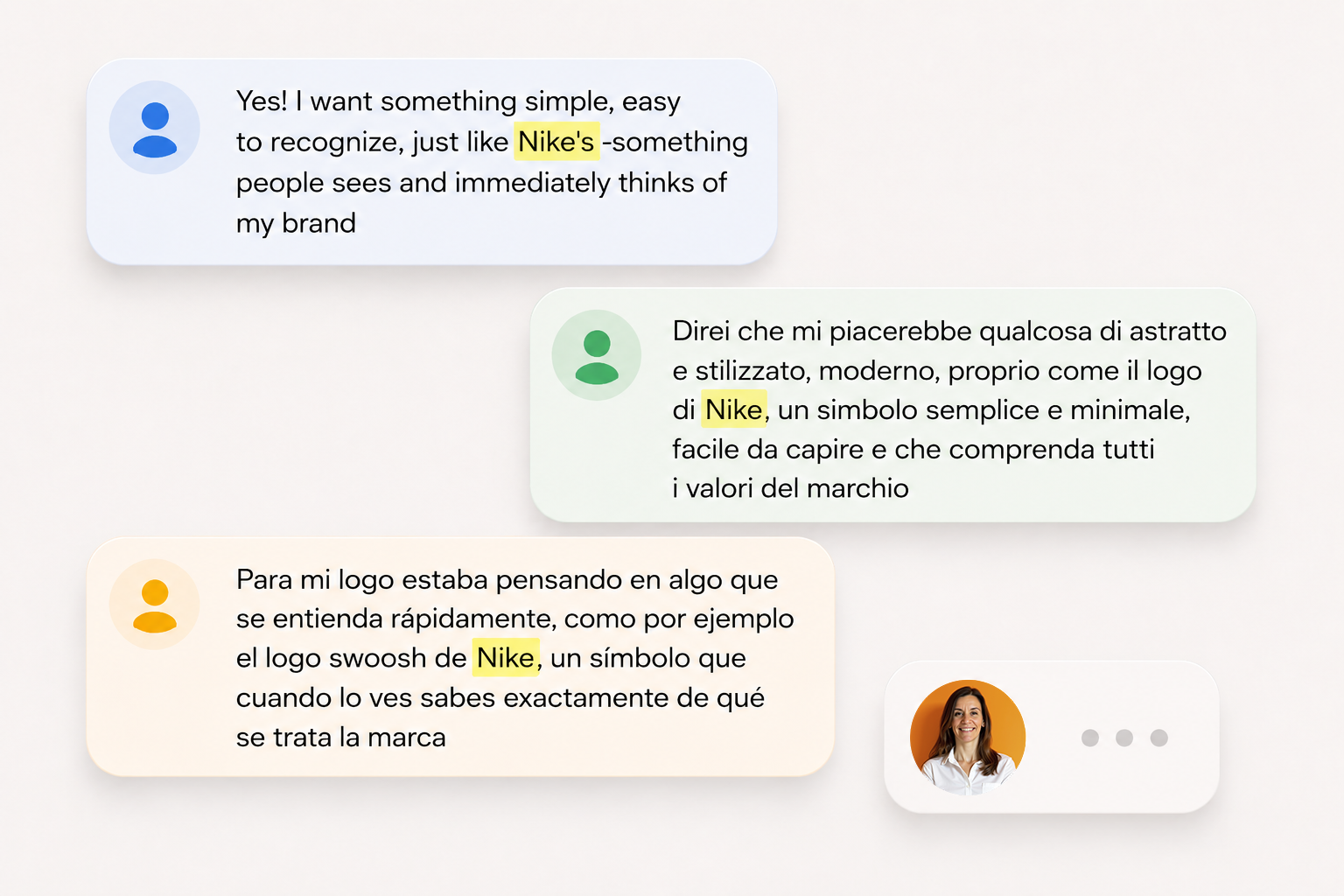
Every now and then, a client comes along with a request that goes something like this: “I want a simple logo, like Nike’s. A symbol people can see and recognize immediately.” And then, as I do every time I have to say something they probably won’t be happy to hear, I take a deep breath, settle into my chair, close my eyes for three seconds, and start typing.
The problem isn’t wanting a simple logo -in fact, it’s desirable for a design to be visually simple. Nor is there anything wrong with hoping that one day your isotype will be recognizable without having to put the brand name next to it. No. The problem is believing that recognition and recall depend solely on the design of the symbol, because that idea is completely wrong.
Let’s take a closer look at the case at hand. Nike’s swoosh does exactly as it should: it follows the angle of the side of a shoe, which is what it was originally created for; it’s simple, dynamic, easy to reproduce at any size and color, and it works just as well embroidered, printed or engraved. It’s an original and efficient graphic mark, but once you separate the swoosh from everything we associate with Nike, there’s nothing in the shape itself that inherently suggests sport or personal achievement, despite whatever elaborate explanations marketing teams may come up with for it today. We don’t see the swoosh and think of Nike simply because of its shape, no. We do it because there’s an gigantic machine behind it dedicated to making the Nike logo, well, the Nike logo.
New simple, original, clever and perfectly functional logos are designed every day: geometric symbols, animals reduced to three lines, letters turned into abstract shapes, ingenious monograms and brilliant uses of negative space. But the vast majority of them will never be recognized by the general public -not because they’re bad logos, but because the brands behind them don’t rely on a team of professionals working over decades, with a very healthy budget, for advertising and marketing actions on a global scale, as Nike does.
More budget for marketing means more visibility, and more visibility brings greater recognition -Nike’s logo is everywhere today, which is why we know it exists and identify it whenever we see it. On the other side of things, a logo that isn’t seen often enough will naturally be harder to remember.
Because it isn’t just about the logo. There is a whole world around Nike: a narrative, a history, a message, a system of meaning built through both visual and verbal language. What is said, how it is said and where it is said are all decisions carefully considered and executed with the specific purpose of achieving concrete goals.
It wasn’t the swoosh that made the company famous. It is the fame of the company that makes the symbol recognizable.
Now, I’m not saying the logo isn’t important -not at all! What I’m saying is that the logo doesn’t make the brand. For a logo to identify a brand, there first has to be a brand. Because a brand consists of a system of values, a message, a promise; a universe of meaning that goes beyond the product or service itself and distinguishes it from other virtually identical products or services. And the logo’s job is to convey those values and that message, not only through graphic design, but also through marketing efforts dedicated to loading a symbol or a word with meaning, associating it with the promise the brand wants to communicate to its audience.
And there’s something else I’d like to tell the client, something very, very important: not every brand needs to be Nike! The vast majority of brands don’t operate globally or appeal to mass audiences, so their success doesn’t depend on people recognizing their logo equally well in the United States and Malaysia.
So, once I’ve explained all this, I’ll take another deep breath and readjust myself in my chair before telling the client that yes, of course I can create a simple logo “like Nike’s” and a visual system that works perfectly for their brand… but they should keep in mind that recognition is built through a good message, lots of exposure, and above all, consistency over time.